CASE STUDY NO. 4
Now Live
"Now Live is easy-to-use, fast to setup and scalable for the Shopify Plus brands. Now Live brings a live shopping experience directly to your storefront." – Now Live

"Now Live is easy-to-use, fast to setup and scalable for the Shopify Plus brands. Now Live brings a live shopping experience directly to your storefront." – Now Live

Now Live is a Shopify app designed to allow e-commerce merchants to host live events, directly engage with their customers, and facilitate real-time product sales. Recognizing the opportunities of interactive online experiences, Now Live aims to bridge the gap between traditional e-commerce and the dynamic engagement of live shopping networks.
Conducting research of existing chat functionalities to identify established design patterns, user expectations, and best practices.
Defining information architecture for the chat feed to ensure intuitive navigation, improve content clarity, and optimize the overall user journey within the live chat environment.
Crafting the dynamic behavior and responsiveness of chat elements, including multi-threaded conversation logic, real-time message handling, and interactive promotional features to aid seamless user-user and user-merchant communication.
Developing and implementing a cohesive, user-friendly, and scalable visual interface for the chat component, focusing on typography, color palettes, and iconography that enhance readability and maintain brand consistency.
Writing clear, concise, and helpful labels, instructions, and system messages embedded directly within the chat interface to guide users and improve usability.
Partnering closely with the Project Manager, Lead Developer, and the Now Live founder and CEO to integrate design solutions with business objectives and technical feasibility.
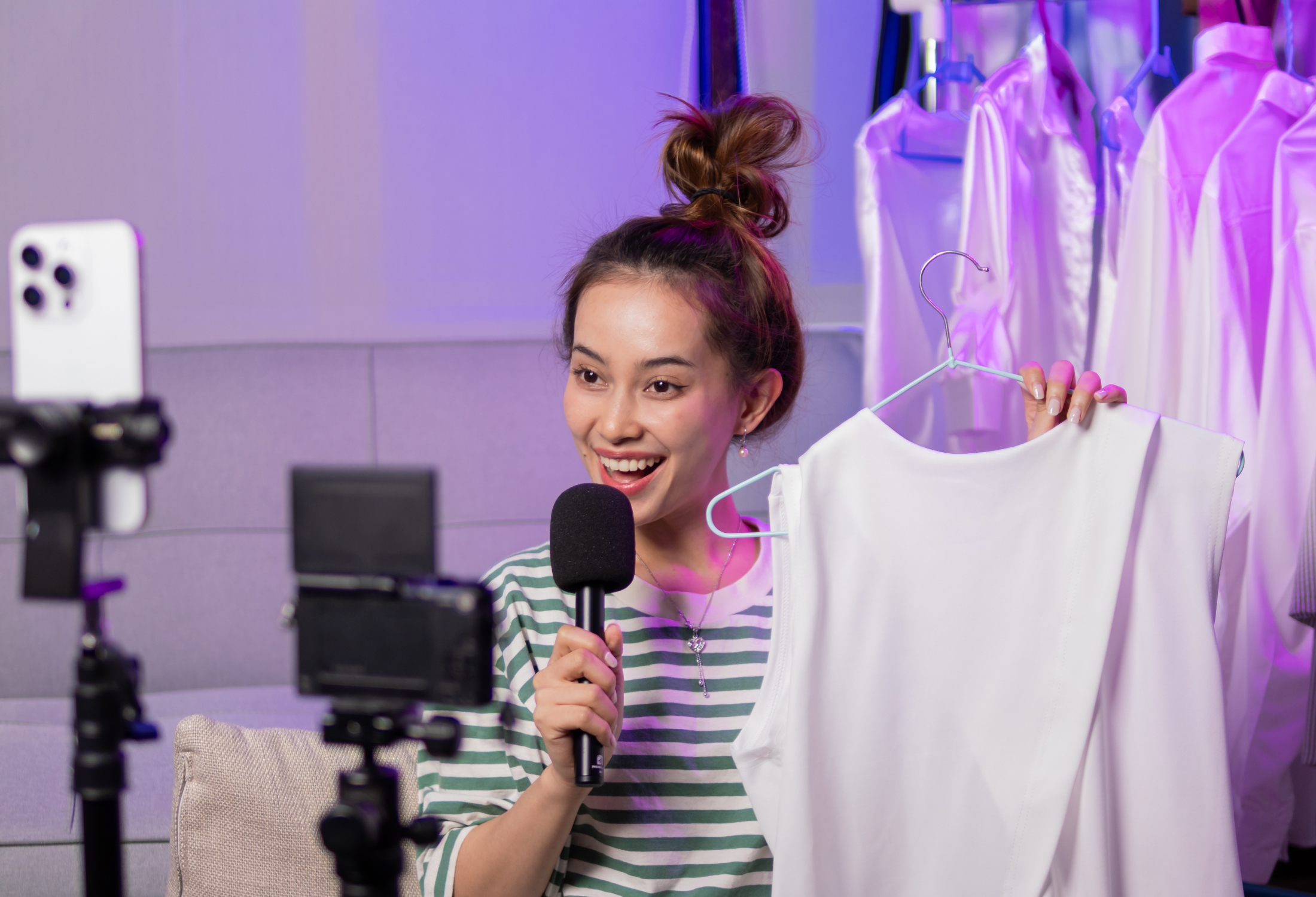
I was tapped for this project to fix the initial design. The previous design failed to address crucial features and functionalities and was not set up to support the desired user experience. In theory, a simple dialogue between two users is fairly straightforward. But the unique challenge faced in the context of Now Live is that users will not only engage in conversations with each other but more importantly, with merchants.
The original desktop design.
The original mobile design, bearing the same major UX issue - chat differentiation and lack of multi-threading.
I analyzed the chat features of platforms known for their real-time interaction and community engagement (Reddit, YouTube, iMessage) as well as direct competitors of Now Live. This helped identify established patterns for threaded comments, user differentiation, and promotional placements.
Based on the analysis, I established several key principles to guide the redesign, including:
Visual Hierarchy: Using indentation and subtle visual cues to indicate replies and threaded conversations.
User Differentiation: Employing distinct color assignments to clearly distinguish between merchant and customer messages.
Promotional Integration: Dedicated and consistently placed space for real-time promotional messaging.
Clear Input and Feedback: Providing a user-friendly input field with character limits and requiring user registration for participation.
I developed wireframes for both mobile and desktop interfaces, focusing on the sign-in flow, the structure of chat cells, the placement of promotional messages, and the user reply experience.
I then designed a component library outlining the visual specifications and functionality of key chat elements.
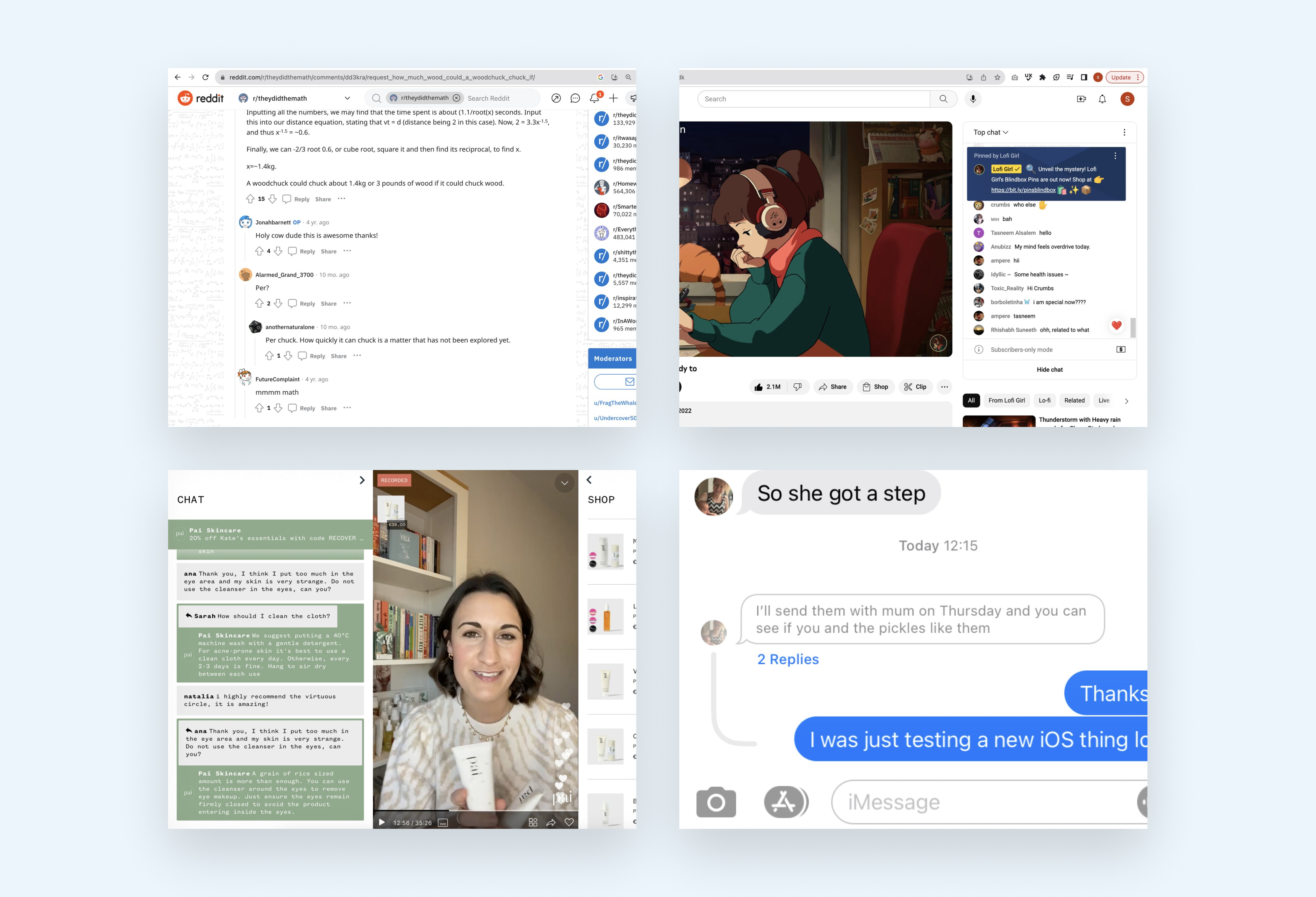
Competitor analysis examples.
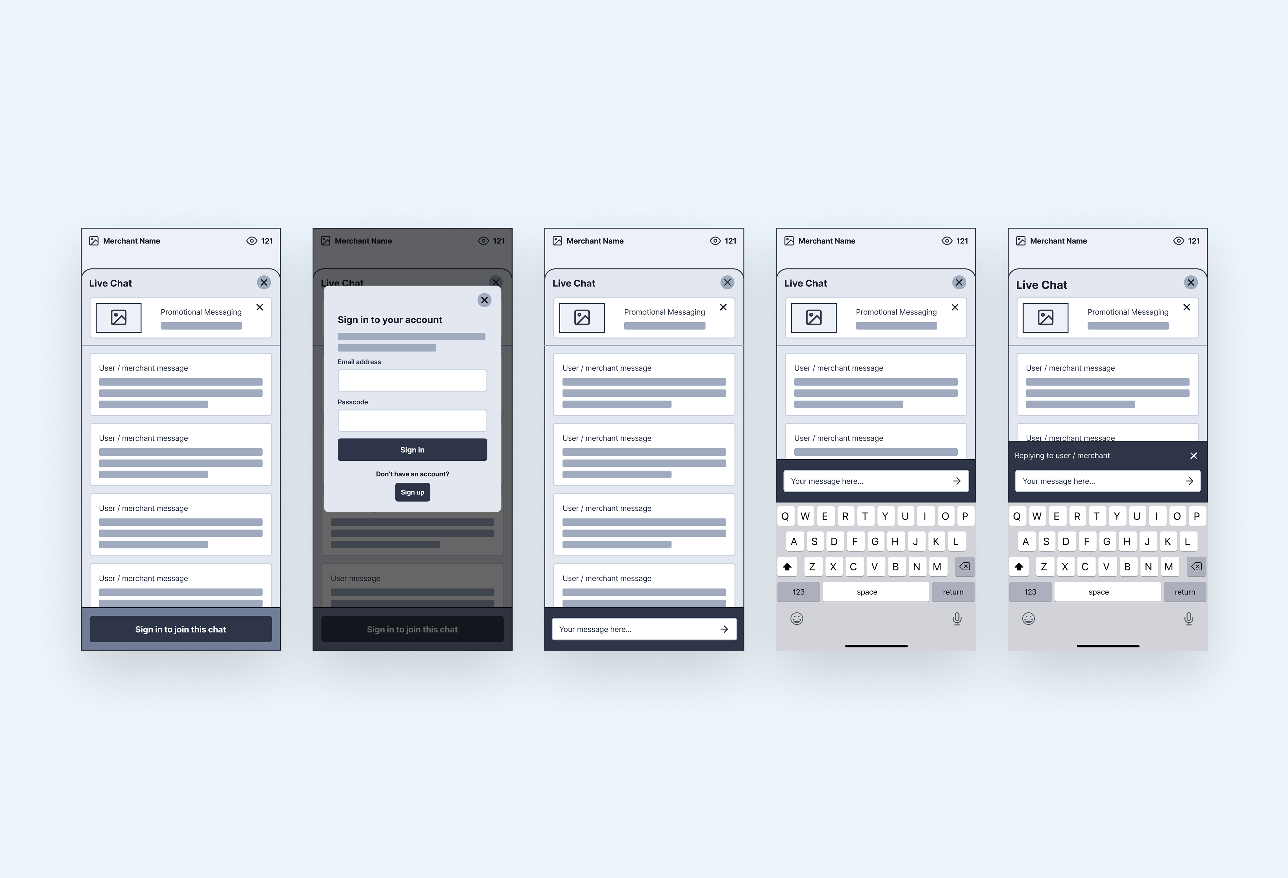
Wireframe examples for the mobile experience.
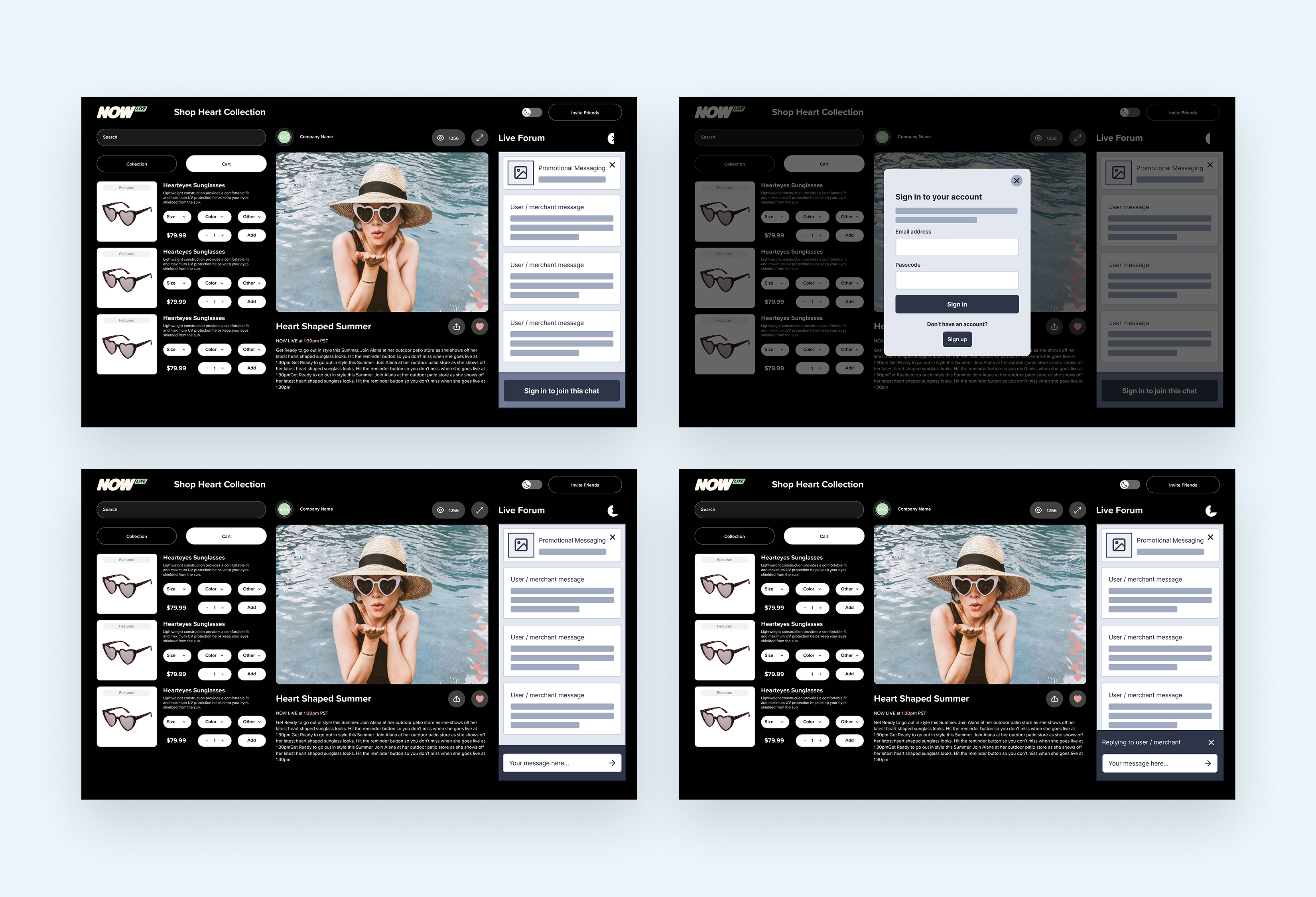
Wireframe examples for the desktop experience.
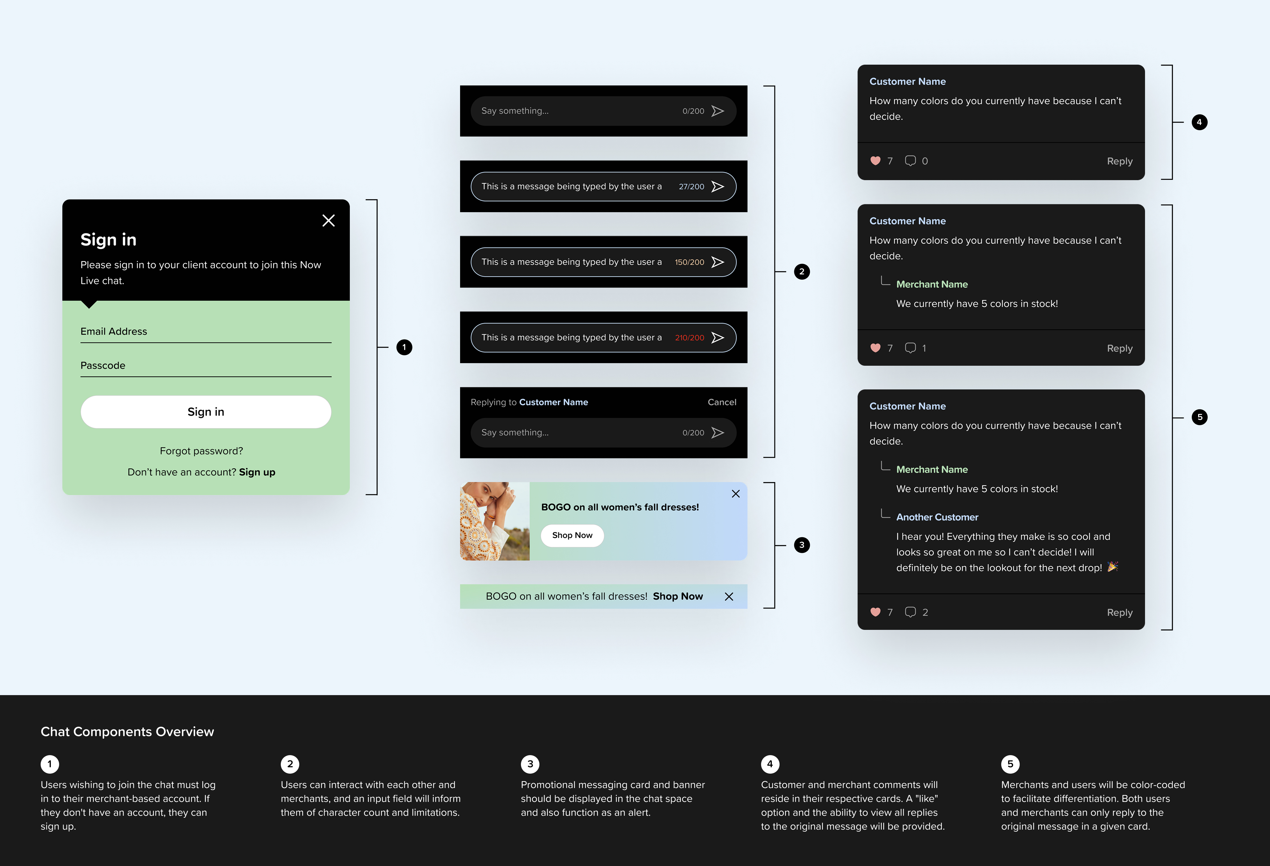
An abstract of the component library and documentation provided to the developer.
The redesigned chat functionality incorporated the following key features:
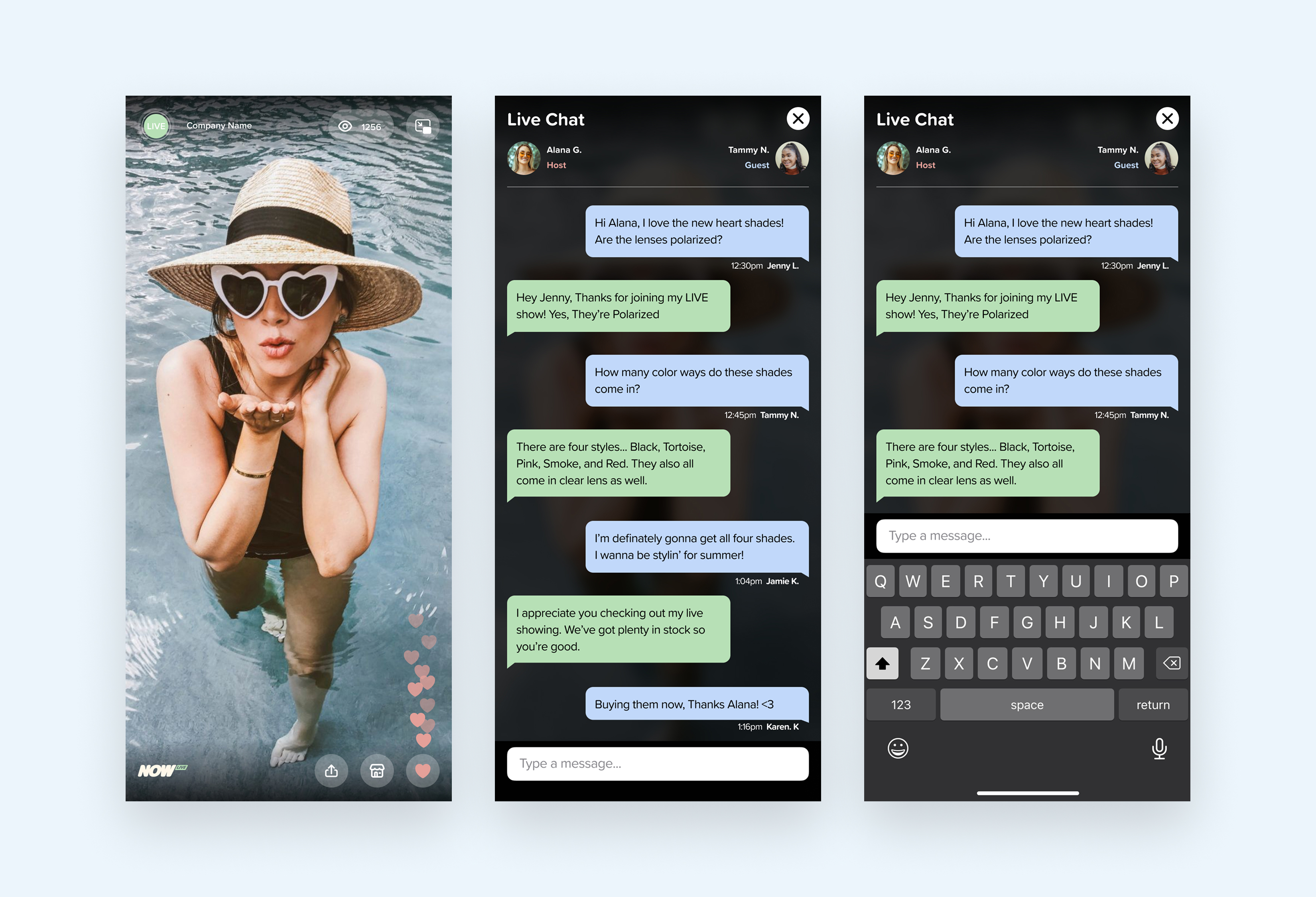
Utilizing indentation, iconography, and subtle visual cues to enhance readability and comprehension of the conversation flow.
Enabling users, both merchants and customers, to directly reply to specific messages, creating more organized and focused conversations.
Clearly identifying customer and merchant messages through distinct visual styling (e.g., color assignments).
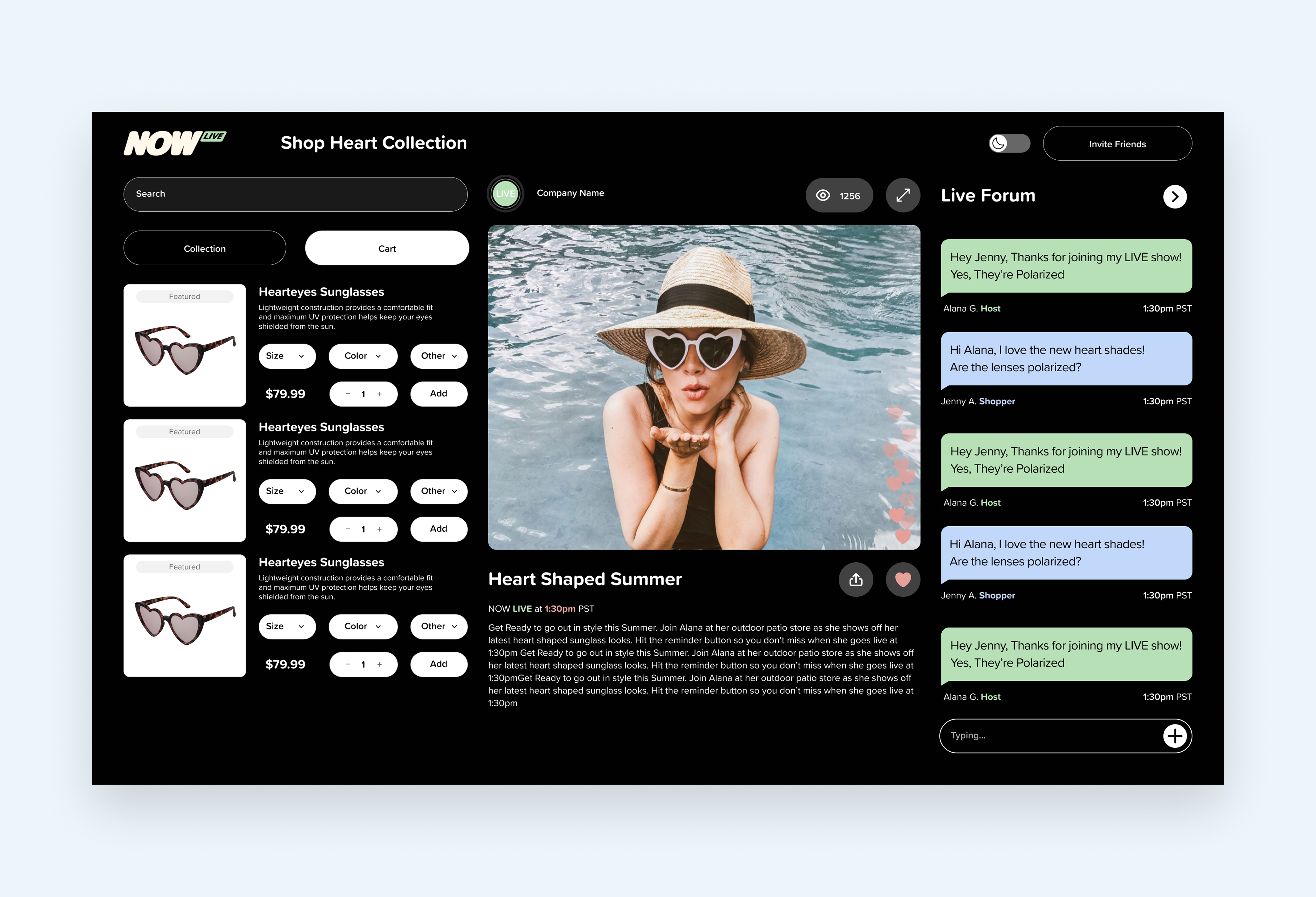
Dedicated space at the top of the chat for real-time promotions, ensuring visibility without disrupting the main conversation flow.
Requiring users to log in to participate, fostering accountability and potentially reducing noise.
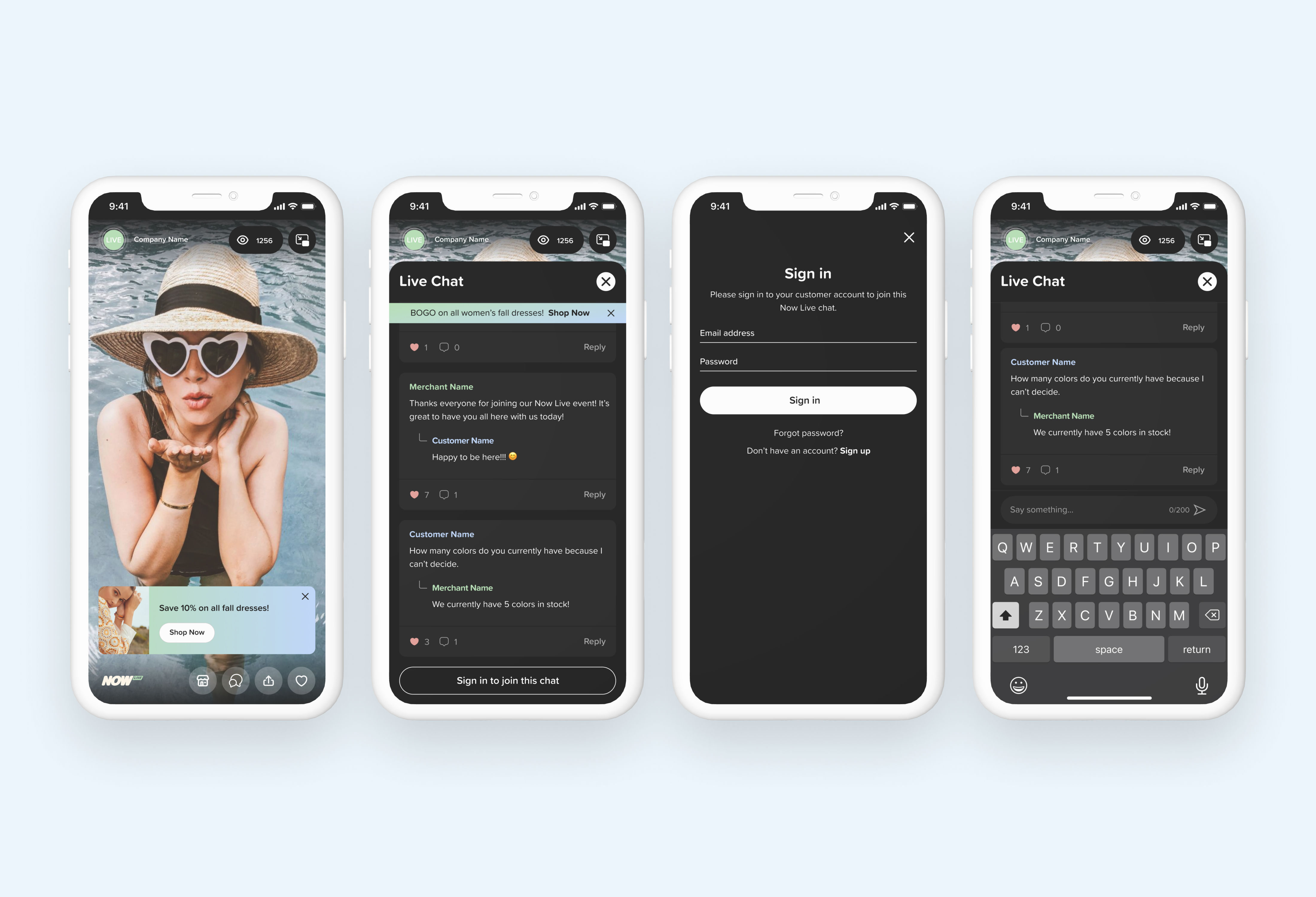
The mobile experience showing a portion of the user flow.
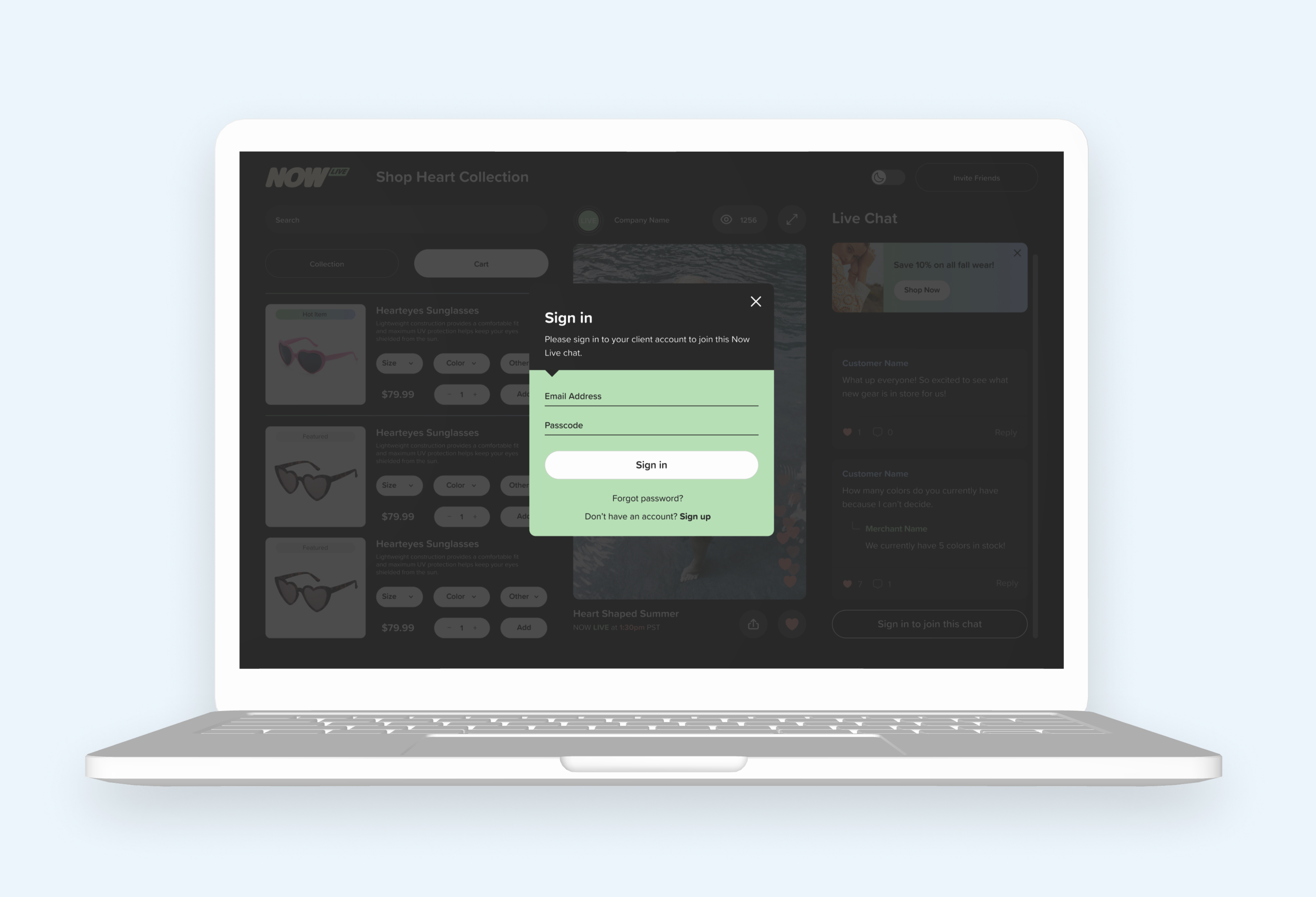
The sign in modal for the desktop experience.
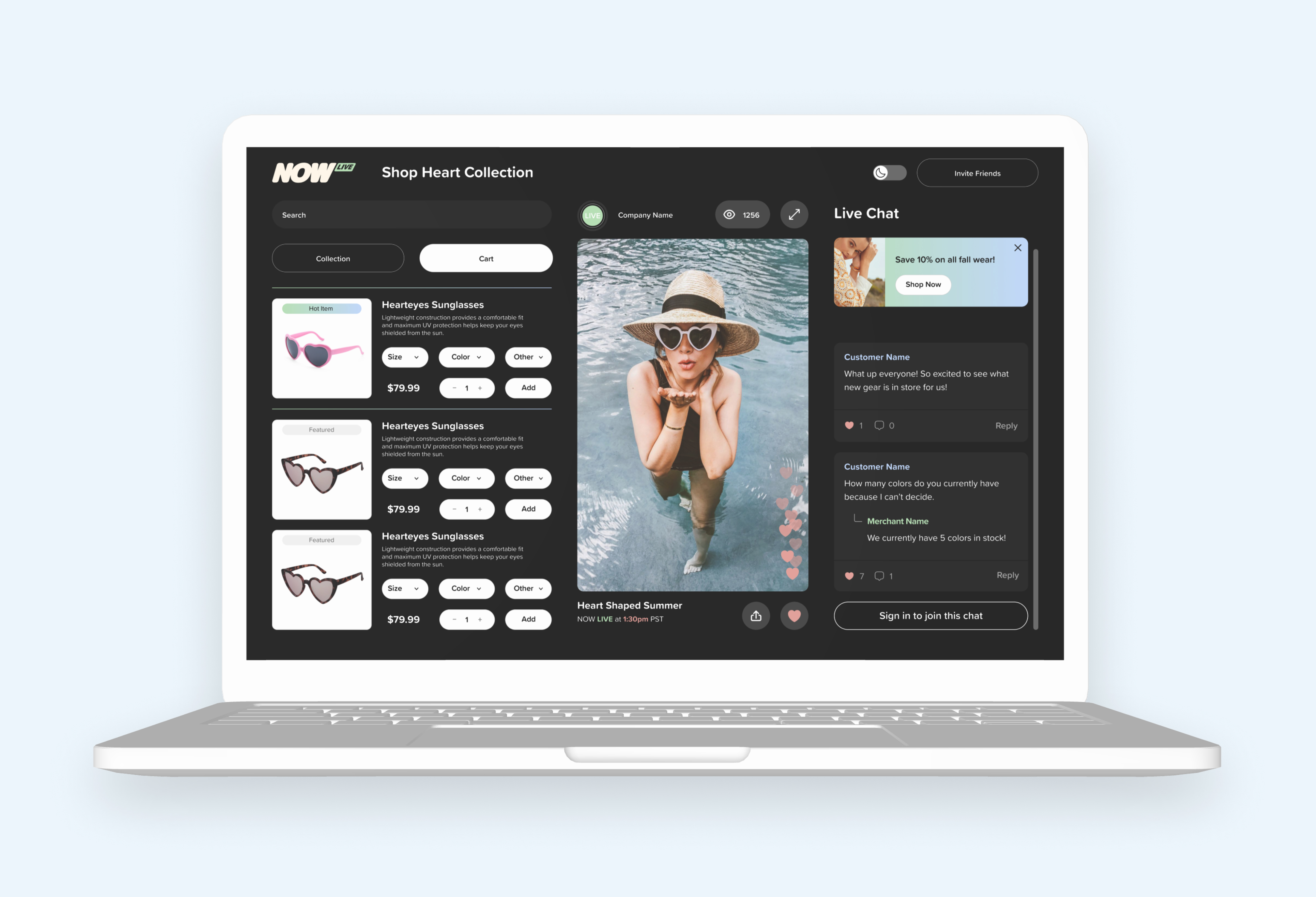
The entire UI experience for desktop.
The redesigned chat shipped with threaded conversations, clear merchant-to-customer differentiation, and a dedicated promotional messaging layer. None of which existed in the original. The component library gave the development team a scalable foundation to build on rather than a one-off solution. One merchant reported $15K in sales during a single live event using the new chat, which was a good early signal that the experience was working.
Real-time interaction design has almost nothing in common with static page design. Threaded conversations, merchant-to-customer differentiation, live promotional messaging; these are systems problems as much as design problems. This one was a good reminder that the most useful thing a designer can do sometimes is study how people actually talk to each other before touching a single component.